
Cover art for WRITTEN IN MY OWN HEART'S BLOOD!
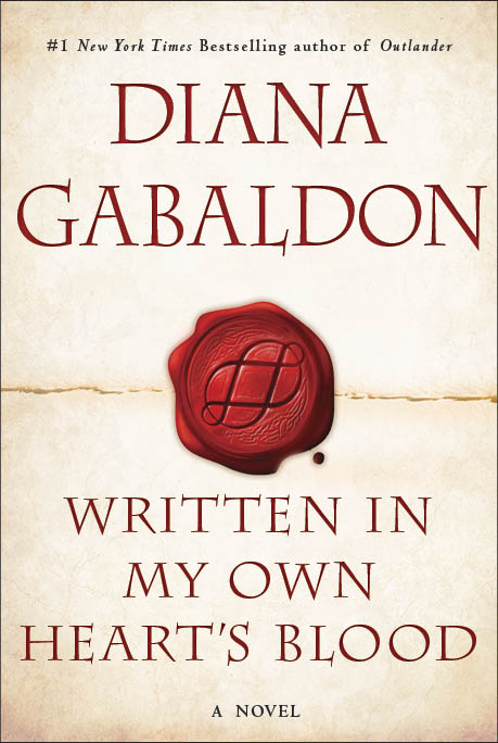
The US cover art for Diana Gabaldon's upcoming novel, WRITTEN IN MY OWN HEART'S BLOOD (aka MOHB, MOBY, or Book 8), was unveiled yesterday on EW.com. Click on the image above for a bigger view.
I think this is a beautiful cover, and very appropriate to the book! Diana says the symbol on the red wax seal is called an octothorpe. I think it's a very intriguing design, with lots of potential for Deep Meaning. <g>
First of all, I like the red-on-parchment color combination. It's soothing to look at, somehow (in a way that the "Green Slime" ECHO paperback is emphatically not!) and the effect is both elegant and inviting. Almost as though the book is saying, "Come break this seal, open me up, and see what's inside!" <g> I like that.
My first thought when I looked closely at the octothorpe design was, "Oh, cool, it's a pair of Moebius strips!" Then I looked closer. "No, it's a pair of slightly-distorted, interlocking infinity symbols. Even better!" When I look at the image, my eyes trace those loops over and over and over. It's sort of hypnotic. <g>
We've had some interesting discussion on Compuserve in the last several years about Moebius strips and infinity symbols and how they relate to the OUTLANDER series, and to time-travel in particular. Diana made an interesting comment about Moebius strips on Compuserve in 2009, and it came to mind immediately when I saw this design:
Fwiw, the fact that we perceive time to be linear doesn't mean it _is_. (Picture a bug walking along a Moebius circle made of paper, I mean. To _him_, he's walking a straight line. And in fact, he is. It's just that he's also walking on both sides of the paper.So for me, the double infinity loops in the octothorpe represent the time-travelers. Not just Claire, but Bree, Roger, and Buck, too. And I just LOVE the interlocking nature of the design. I've said many times that this is all one immense story, and "everything interconnects". I think the octothorpe captures that idea beautifully. All these characters' lives are inextricably intertwined with one another, and always will be. One of the things I'm looking forward to the most in this book is seeing how those relationships between the characters change, not only because of what happened in ECHO, but as a result of as-yet-unknown events in MOHB.
And for those who don't feel inclined to think Deep Thoughts about time-travel, the two interlocking loops could also be Jamie and Claire's relationship, or Roger and Bree's. (Both, I think. <g>) A love that endures forever, that even a long separation, or death itself, can't diminish. I am very much worried for Roger in this book, praying that he'll eventually be reunited with his family, and I find this symbol reassuring in that context.
What do the rest of you think of this cover?


I like your thoughts about the cover for MOBY. I really like it, too. Simple and fresh (clean). The colors go well together and the symbol is so appropriate because of the 8 story lines. I like that the circles (lines) interlock. Wonder if that's a hint as to how the 8 story lines turn out.
I, too, am worried about Roger. Well, I'm worried about a few other story lines, but his is the one that I worry about the most.
Thanks, for sharing your thoughts.
Diana posted it on the blog at 8:42 PM her local time which suggests to me someone from her publisher leaked the title to ew.com and Diana therefore posted it.
Jerry
No, that was intentional! Apparently EW.com had a deal with Random House that they would be the first to officially "unveil" the new cover. That's why they put it out on their site a few hours before Diana had it up on her blog. It was all prearranged, according to Diana.
Karen
Thanks for the info. I haven't checked the CompuServe thread on the new cover so was unaware of the deal.
Jerry
i just hope i can think out a way to get the new big book upon it's launch since i don't have a credit card which is usually preferred by online sites.
still very happy to hear about any update about big book 8!
I'm really looking forward next March for MOBY, and having her here for our writers' conference in 346 days! ;-)